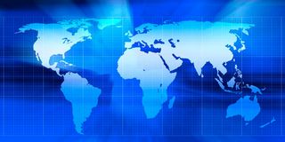
The UN has passed a non-binding resolution to endorse the Equal Earth Projection , a map which more fairly represents the true size of the Earth’s landmasses. The current commonly used projection, called the Mercator Projection , greatly exaggerates land towards the north and south poles, which makes Africa look much smaller . In the Mercator projection, countries near the north and south pole can be anywhere from two to 14 times their true size. In the Equal Earth projection these distortions are minimised, making Africa look larger in comparison.
We asked Jack Swab and Derek Alderman , cartographers and geographers who study the social and communicative power of maps, to explain what’s going on.
What is a map projection?
A map projection is a technique that cartographers (map-makers) use to transform the round, three-dimensional Earth into a flat, two-dimensional map that we see on the wall or on our computer screen. As cartographers flatten the globe, the map becomes distorted, changing shapes and areas. There is no map projection that does not distort the Earth, but some projections are better suited for some uses than others.
A cartographer’s job is to choose from the hundreds of different map projections, and consider where the map is focused and how it is going to be used. No single projection is best for every use. This new Equal Earth projection is better suited than Mercator for producing global scale world maps for educational, public communication and policy purposes.
The Equal Earth supports a more accurate geographic understanding of the relative sizes of countries and continents. It provides a fairer perspective for the public to compare regions in terms of population, environment, development, politics and other global patterns.
Is the Mercator projection still useful?
While the Mercator projection isn’t good for showing the size of the Earth’s landmasses, we won’t see it totally disappear. For example, it’s very useful for navigational purposes as it maintains the accuracy of a compass bearing between two points without having to recalculate it.
This is why most online mapping platforms like Google Maps or Apple Maps rely on a variation of the Mercator projection to provide directions. Using the Equal Earth projection for navigation would not be as effective as the Mercator projection.
How will the Equal Earth projection be used?
Map-making is decentralised and there is no single authority regulating which map projection is used. What the UN did was endorse the broader message that Equal Earth is a fairer projection that more equitably displays the true size of the Earth’s land. And although this action is happening at a global level, there are movements underway in cartographic communities to make the Equal Earth projection the default world map projection.
The UN resolution by itself will not make Equal Earth a globally adopted projection. That requires intentional revision of maps used in textbooks, databases, media productions and diplomatic discussions, which requires labour and financial investment.
The Equal Earth projection was developed by cartographers and is a popular choice among map-makers since it was unveiled in 2018 . It’s now possible to buy wall maps with the Equal Earth projection on them, and the projection has already been used in a wide variety of media. That said, individuals will need to opt in to using the Equal Earth projection over other types.
Why has the Equal Earth projection sparked resistance?
Resistance to the Equal Earth projection has been quite limited. There were several abstentions from the United Nations General Assembly vote, but most of this was for other reasons. Ukraine, for example, raised concerns over the depiction of the contested Crimean Peninsula on the map, which the Equal Earth Projection website depicts as contested territory .
This spurred a Russian response, along with points from other nations about contested territory. Given the UN resolution was a vote on how the world is portrayed and not about any specific political boundaries (a point that both Russia and Ukraine agreed on), these discussions amounted to geopolitical posturing about non-map issues.
The lone outlier, and only “no” vote against the Equal Earth projection, came from the United States. It claimed that the proposal was part of a “radical and ideological project ” that was not appropriate for the United Nations to be debating. American delegates took issue with language linking Mercator’s distortions to colonial legacies and the marginalisation of Africa. This is not surprising since the current administration denies the existence of structural systems of inequality.
It is hard to miss the hypocrisy at play . The US wants other countries not to discuss the political implications of cartography even as President Trump engages in his own nationalist branding of the map. He has unilaterally renamed the Gulf of Mexico to the Gulf of America and Lake Ontario to Lake America for clear ideological reasons and without international consultation.
How does the new map matter when it comes to changing global views of the world?
The argument that African nations put forward was that the Equal Earth projection is a form of “cognitive justice ”. Cognitive justice recognises that people often equate power and value of places with their apparent size on maps. Traditional views of Africa as a smaller continent compared to Europe or North America typically reflect the perceived importance of these parts of the world.
Equal Earth may make it easier to teach, broadcast and discuss a different view of Africa and its prominence in the world. Today, African countries are among the world’s fastest growing economies and fastest growing populations. Map projections alone cannot change people’s attitudes. Yet, as African nations seek to have more influence in international affairs, correcting the mental map of global leaders is an important step in amplifying the continent’s relevance and rights.